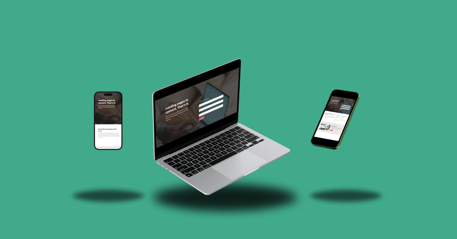
Landing pages and website pages: what’s the difference? It’s easy to confuse the two. Your website is built with one or more pages, each with its own purpose. Pages may include an About Us page, a Services page, a News page, and more. Website pages hold information that potential customers, sponsors, media, new recruits, competitors, or anyone else can see.
Your landing page is one of the most important features in your customers’ journey. It is a page that is built with a particular campaign or goal in mind such as purchases, sign ups, bookings, or enquiries. Customers who click on an ad will land on the landing page – where content relates to the ad, creating continuity in their customer journey.
When you take the time to optimise your landing pages, you should see an improvement in conversion rates and return on ad spend. To ensure you have the greatest opportunity to convert potential customers into actual customers, here are some best practices to yield success.
Know your audience
It’s important to know who is interested in your products and services and understand their behaviour on your website. There are many tools to help you do just that, such as Google Analytics and HotJar. Gathering data through both platforms forms a picture of your customers, what drives them, and their pain points. Data informs the type of content to include on a landing page, including information hierarchy and design, to optimise it for conversions (sales, enquiries, or any other action to achieve your goals).
Demographics
Demographics describe the aspects that make up your target market. This can include age, location, interests, pain points and more. The clearer you are about your audience, based on your products, services and position in the market, the easier it will be to convince them to convert.
Behaviour
When you understand how customers use and interact with your website such as which pages they view, what they read, and what their path to a conversion looks like.
For example, if customers look for more information about products before they purchase, include this information on the landing page to shorten the decision-making process and time to convert. It can also increase customer satisfaction – and keep them coming back for more.
Not only can data and analytics tell you how customers behave on your website, but they also measure other metrics that indicate performance, such as conversion rates and bounce rates. Heat mapping and session recording tools can also tell you what draws the most attention. This can inform design, hierarchy, and copy decisions.
Value proposition and pain points
Your brand has a value proposition. It’s a large part of what convinces a customer to choose your product or service over your competitors. Are you an iOS or Android user? Why? By answering the “why”, you’ll start to touch on the product’s value proposition.
Take the time to consider why a customer would purchase your product or service. What problem does your product or service solve? When you understand this, you can craft a clear value proposition that addresses your audience’s pain points. In turn, this informs the content on your landing page. Highlight your customers’ pain points, and how your product or service makes their life easier/better/pain-free.
Pro tip: Put your value proposition in the headline of your landing page and elaborate with product benefits in the subheading/s.
Persuade with compelling copy
The copy should reflect what your audience wants to see. This is truly where knowing your audience comes into play. Copy should be specific, with only one or two key messages – enough to make your customer convert, but not too much to confuse or overwhelm. Remember: Content should reflect what they saw in the ads.
Your copy should:
- Be concise and focus on the benefits or how your product or service solves a problem.
- Create an emotional connection with your audience.
- Use scarcity and urgency biases (e.g. highlight limited time offers or exclusive deals).
Optimise your CTA
The call to action (CTA) is an important piece of a customer journey. This is often the final convincer, and it needs to be compelling. There are three main elements you should consider:
- Clarity: Make your CTA concise and crystal clear, using action-oriented language (get started, subscribe now) so customers know exactly what to do.
- Placement: Position the CTA prominently above the fold (visible without scrolling). This ensures customers see it immediately.
- Contrasting design: The CTA button needs to stand out. Use contrasting colours and consider white space to draw attention.
Simplify the design of your landing page
Design may not be your cup of tea. Luckily, it is best practice to use a minimal layout, using white space to guide attention. Avoid clutter so your customer can easily find what they are looking for and make their way to your CTA seamlessly.
Leverage social proof
With the number of cyber security threats and scams increasing, it’s important customers can trust your products and their purchase. To alleviate concerns, display testimonials with positive feedback from satisfied customers and display security seals, certifications, or affiliations, you can remove doubt and assure customers they are in safe hands.
Bonus: How important are keywords?
Across your website: very important. It is one of the key factors in organic search rankings. On a landing page, only used as an avenue from a digital advertising campaign: less important.
For an ads-only landing page, the most important factors are going to be value proposition and compelling copy, a clear CTA, and ease of use and design.
If your digital ad campaign is using a webpage as a landing page, which can be found through menu navigation, you’ll need to consider keywords in your copy.
Need a landing page for your ads?
Register via our landing page landing.marketingcanberra.com.au

